Professional Identity for Marie-Laure
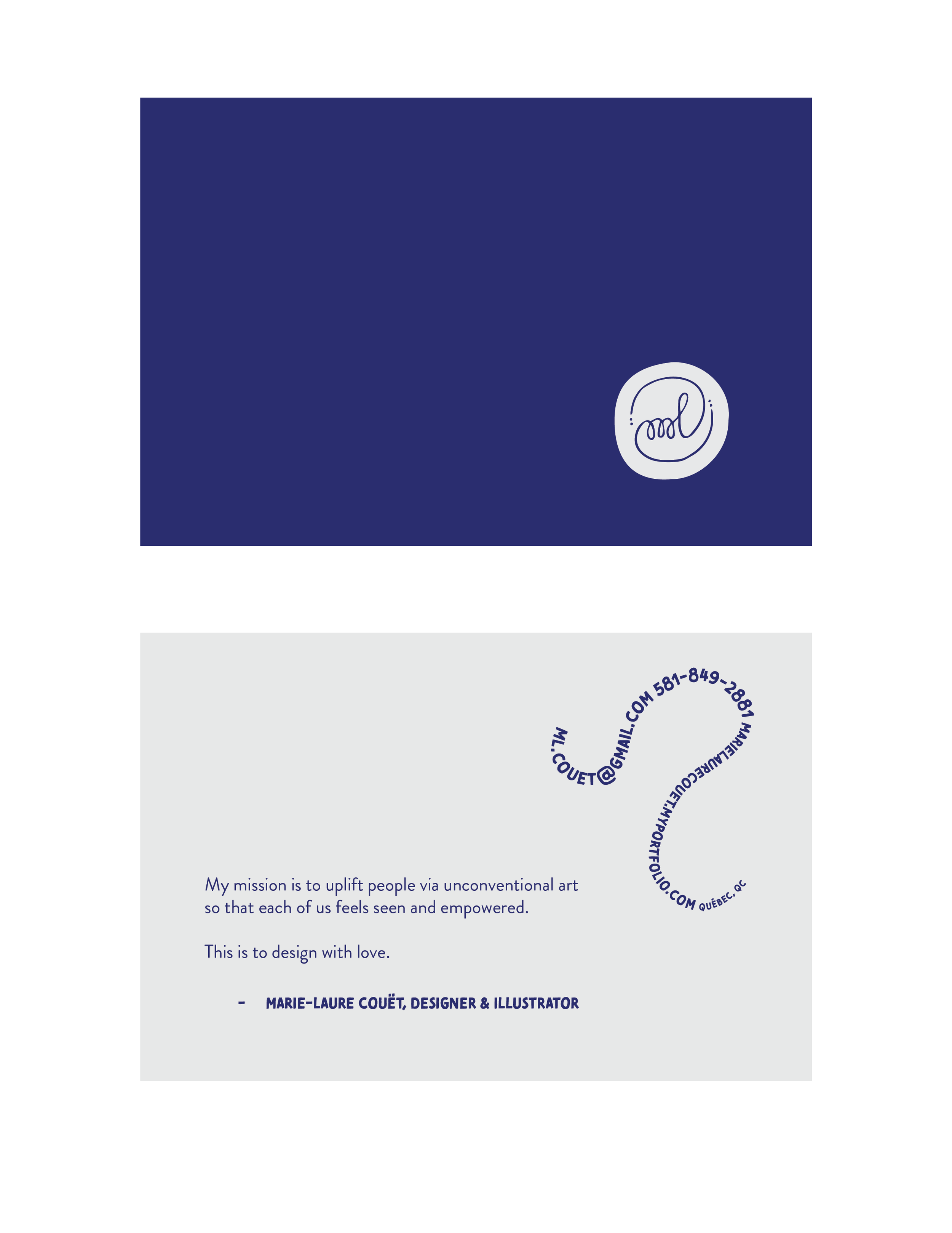
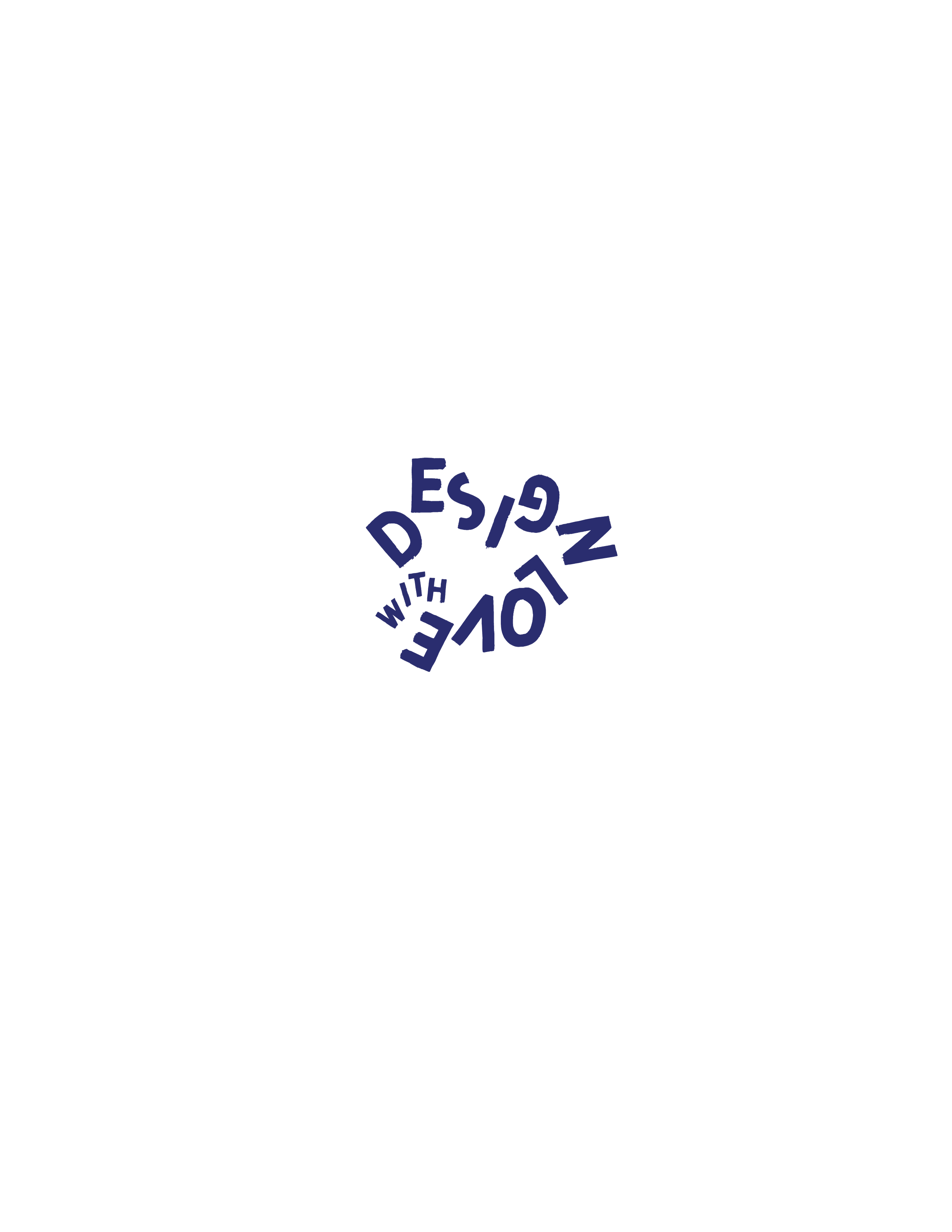
“Marie-Laure’s design philosophy, design with love, is the foundation for the visual language of her professional identity. The design with love concept is manifested in four ways:
1. Honor the ephemeral
2. Embrace the imperfect
3. Let go
4. Impact
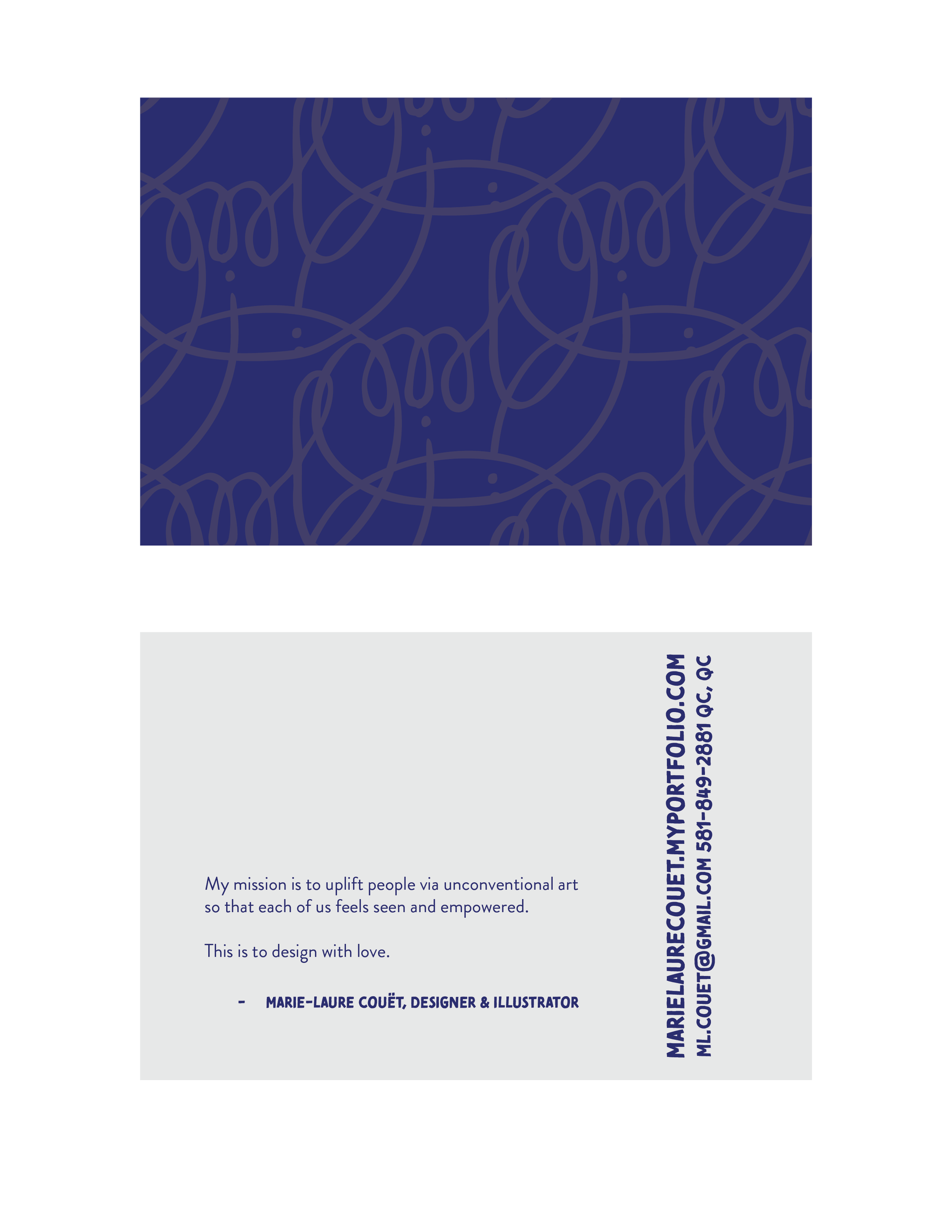
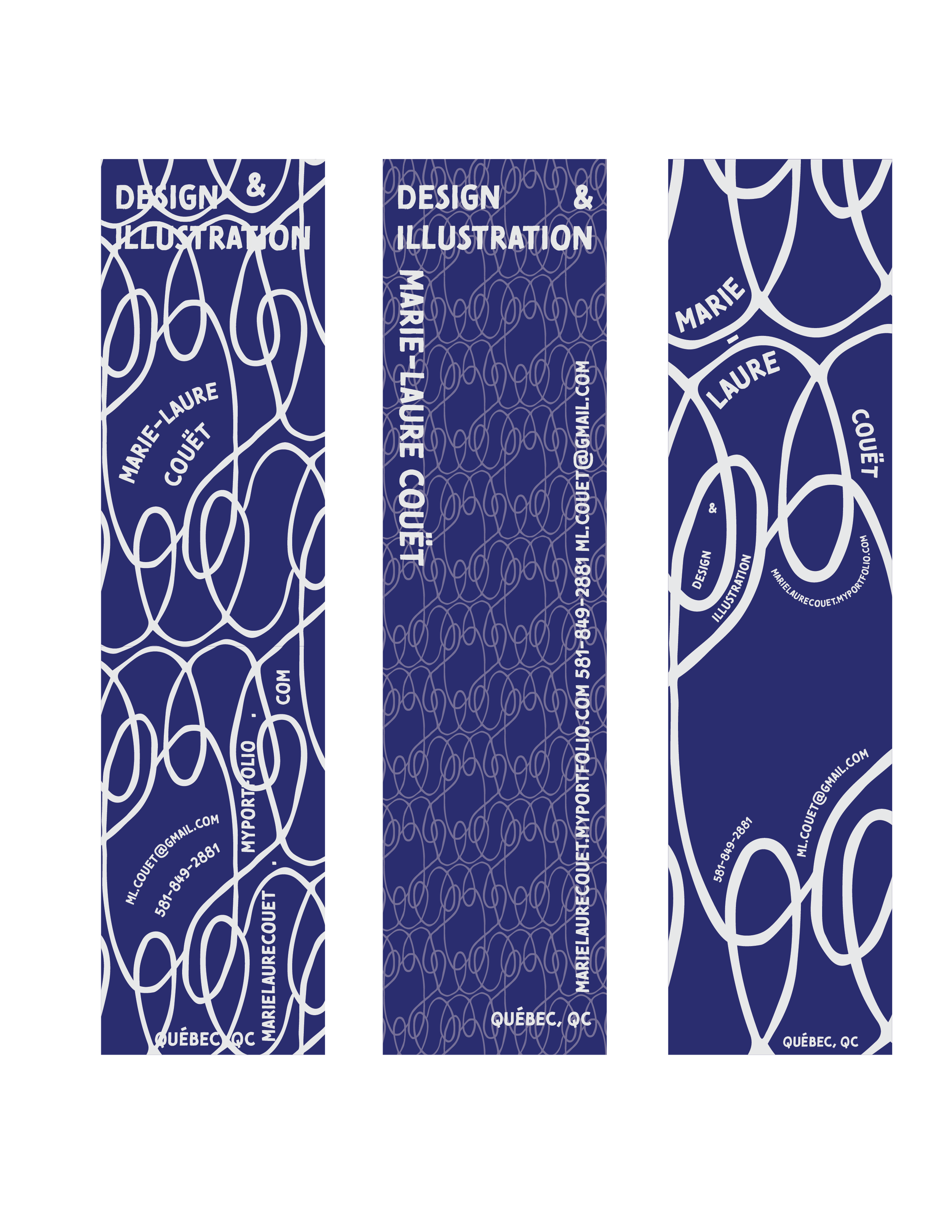
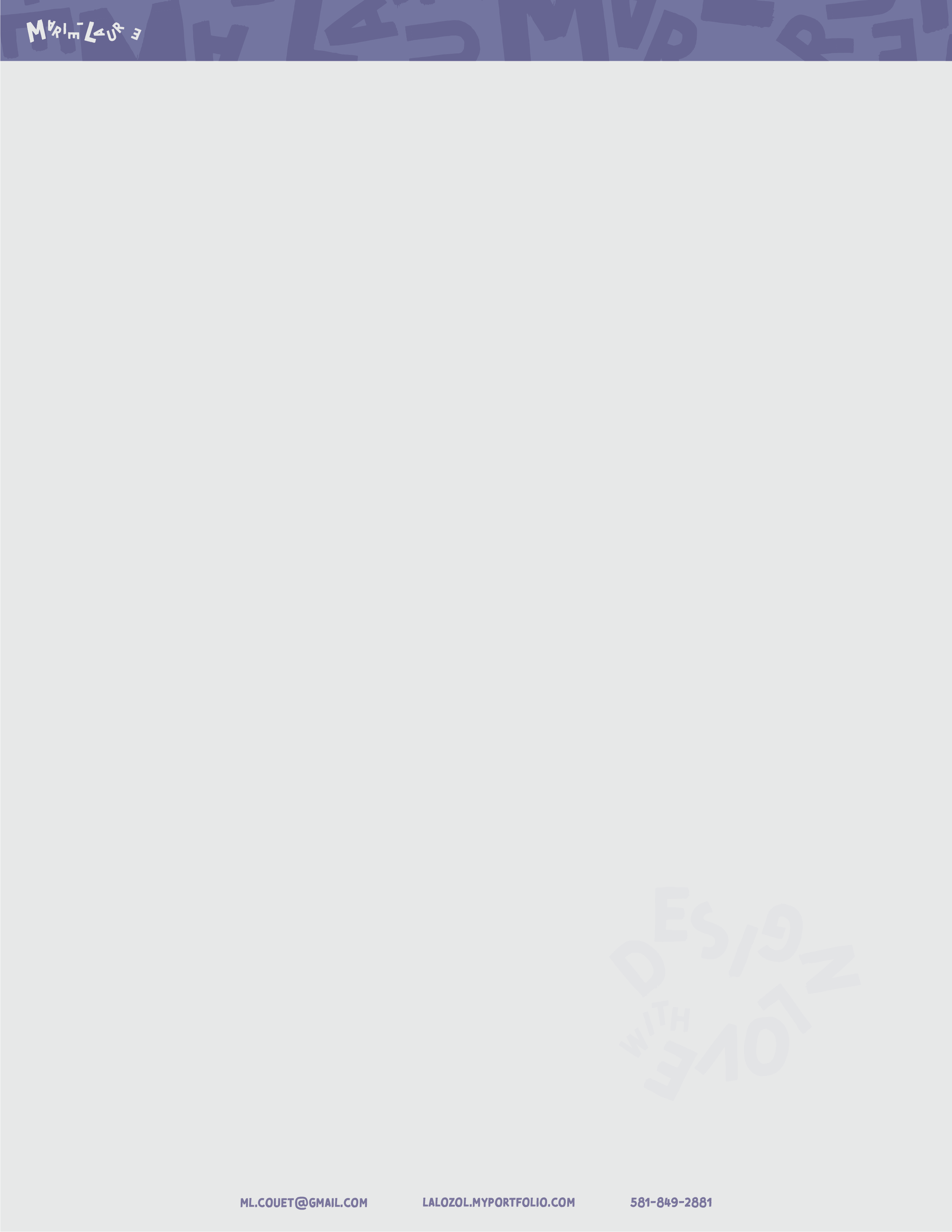
I honor the ephemeral by acknowledging my mortality, reminding myself that I wish to leave this world with an abundance of love. Visually, I have used varying opacities to represent the disappearance of what would otherwise appear solid and immutable.
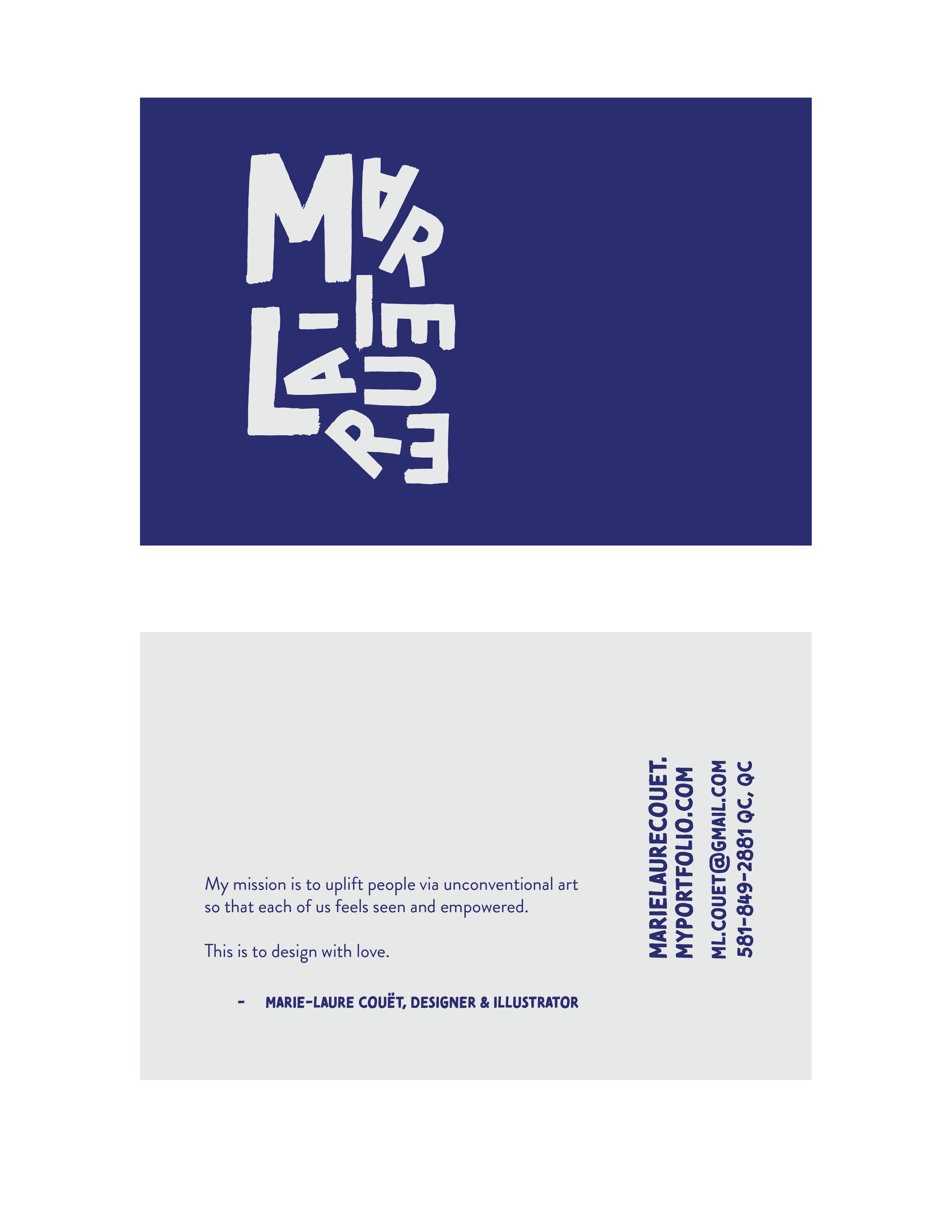
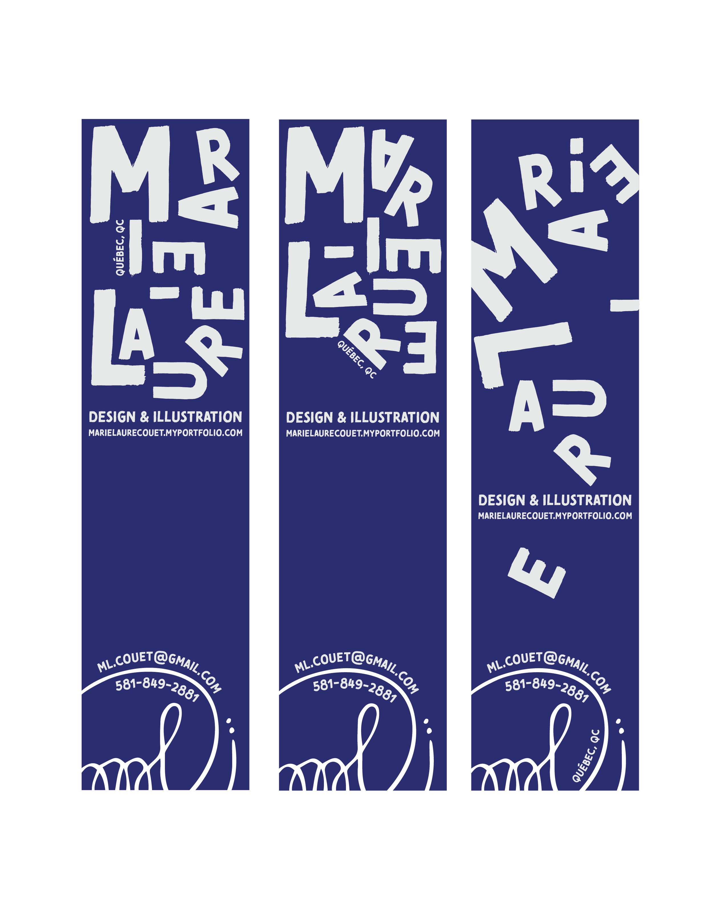
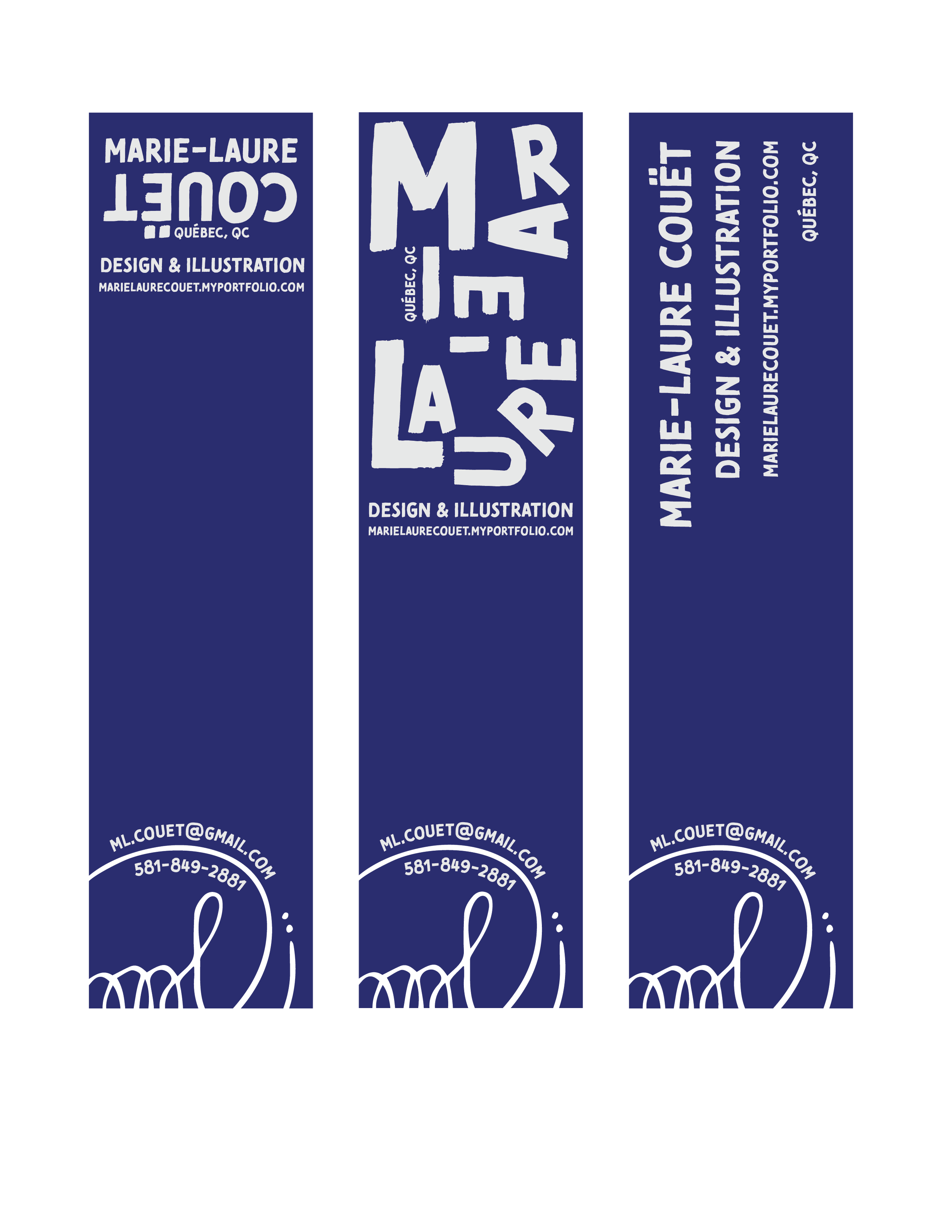
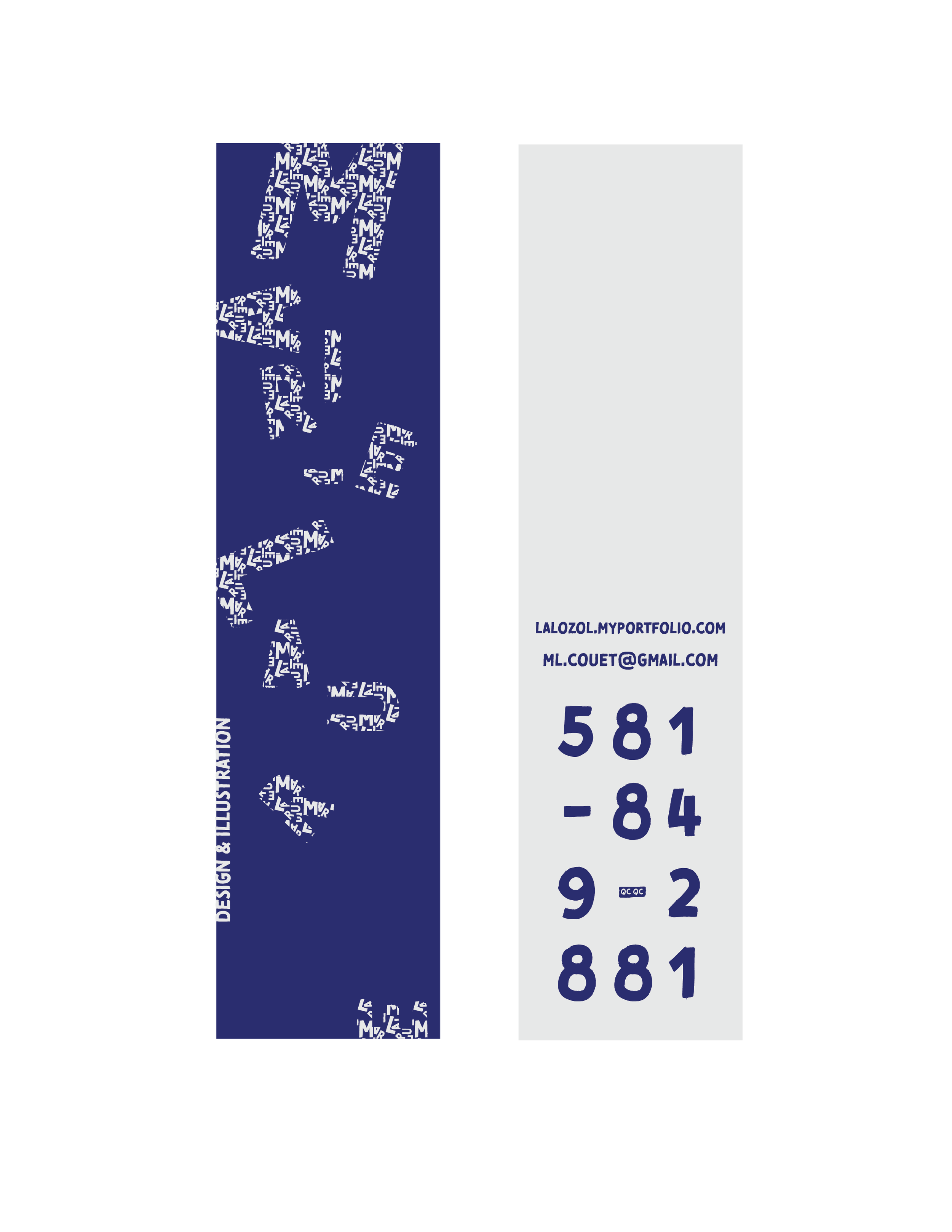
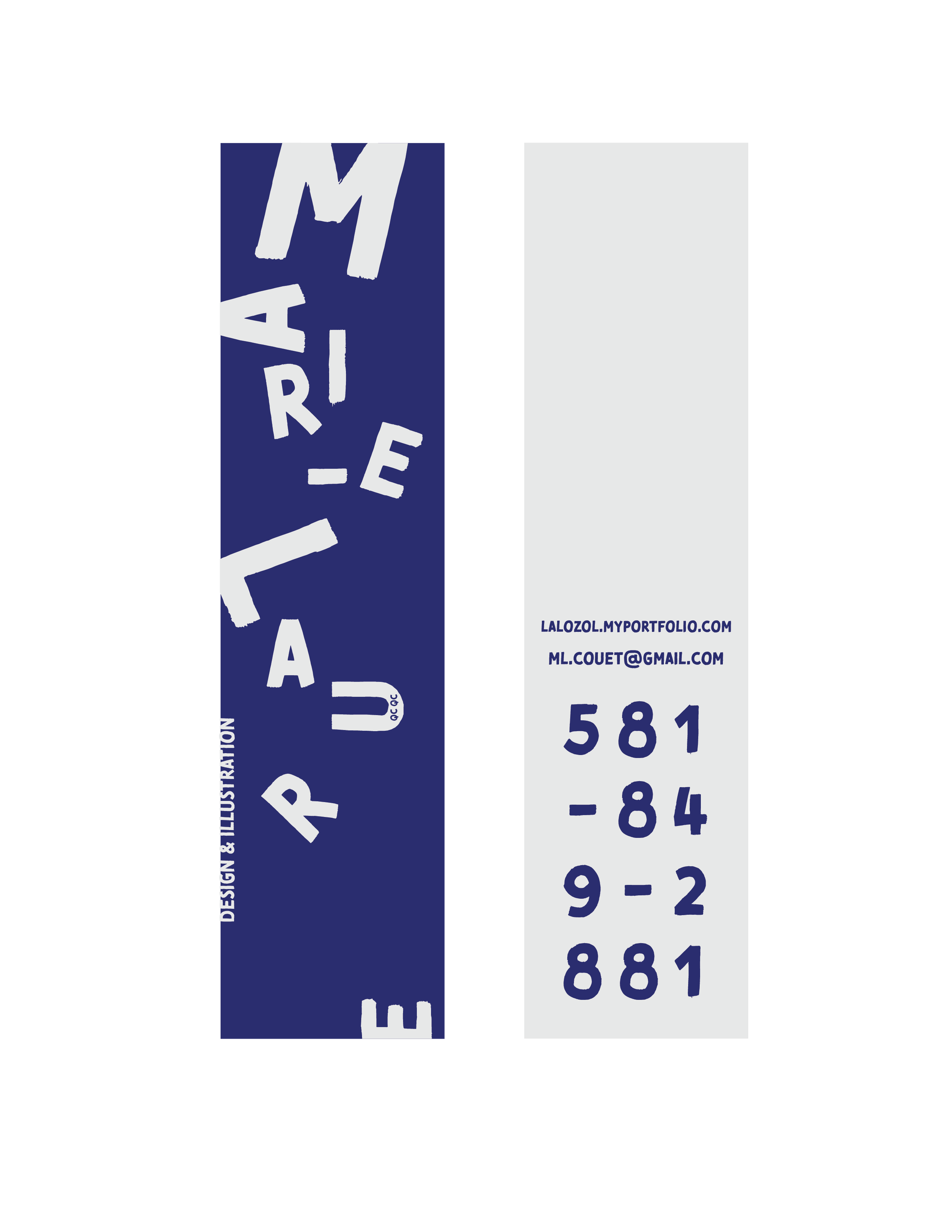
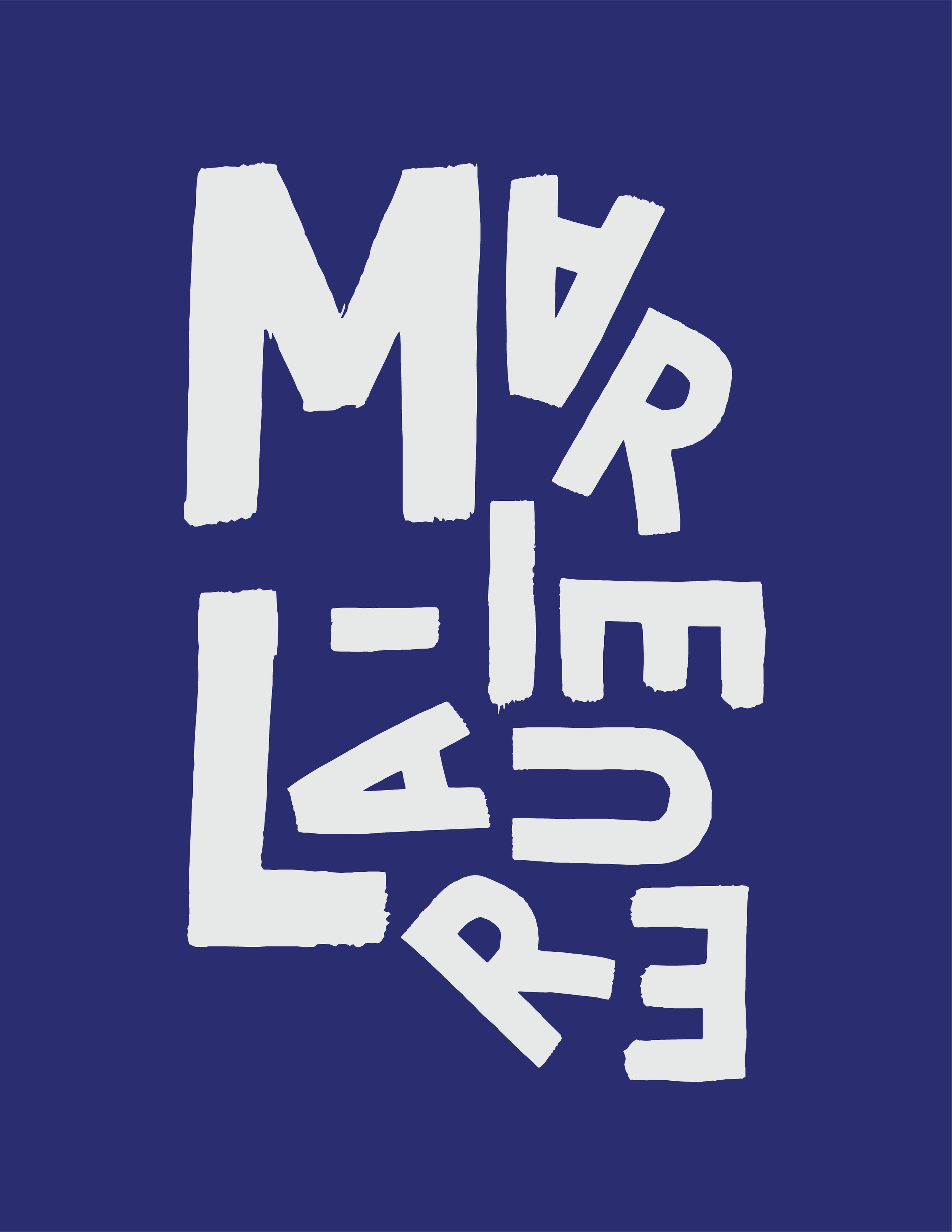
I embrace the imperfections of life, the chaos, the broken bits. It is the old teddy bear, the chipped mug, the worn jeans that are the most loved. Visually, Tomarik Brush is a hand-drawn typeface showing evidence of stray strokes and rough imperfections.
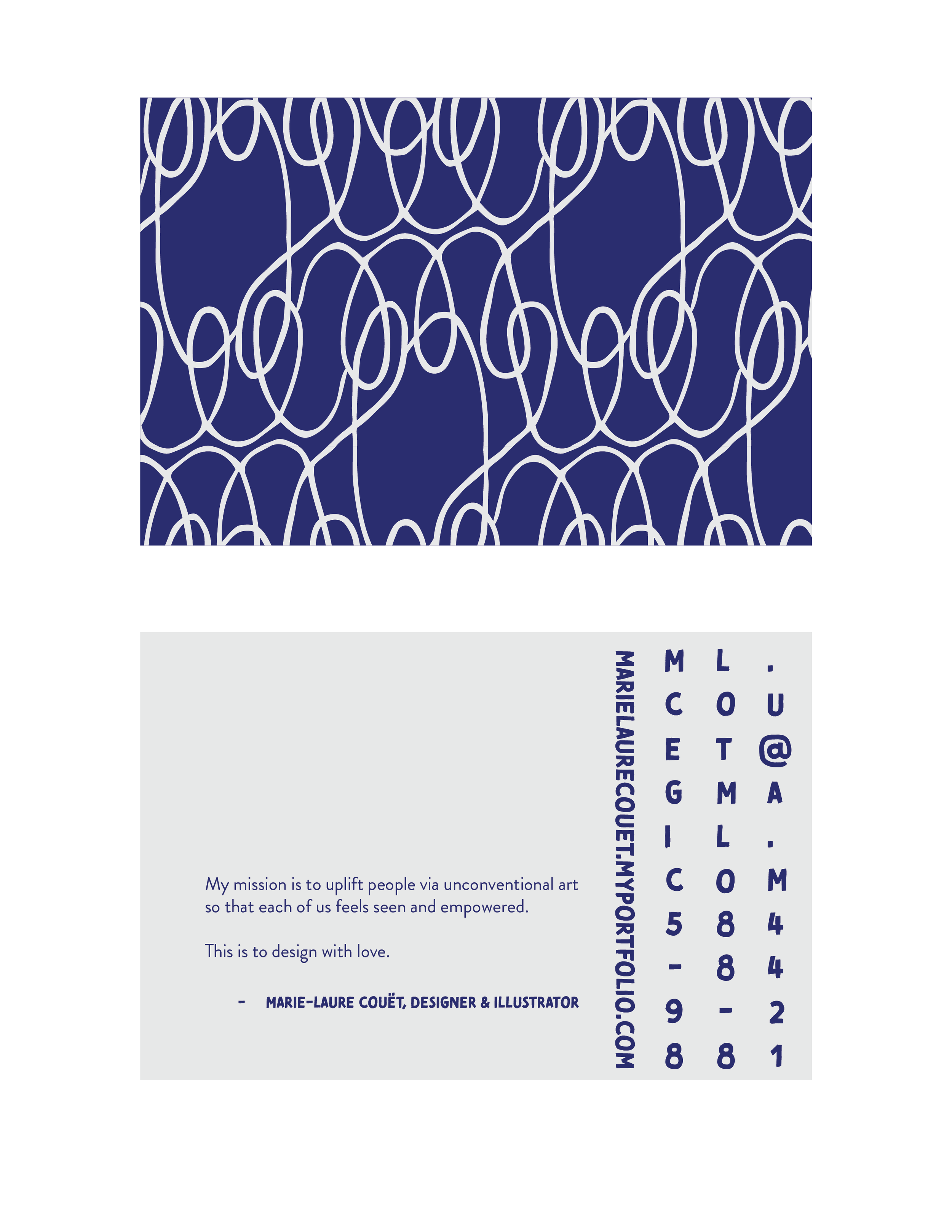
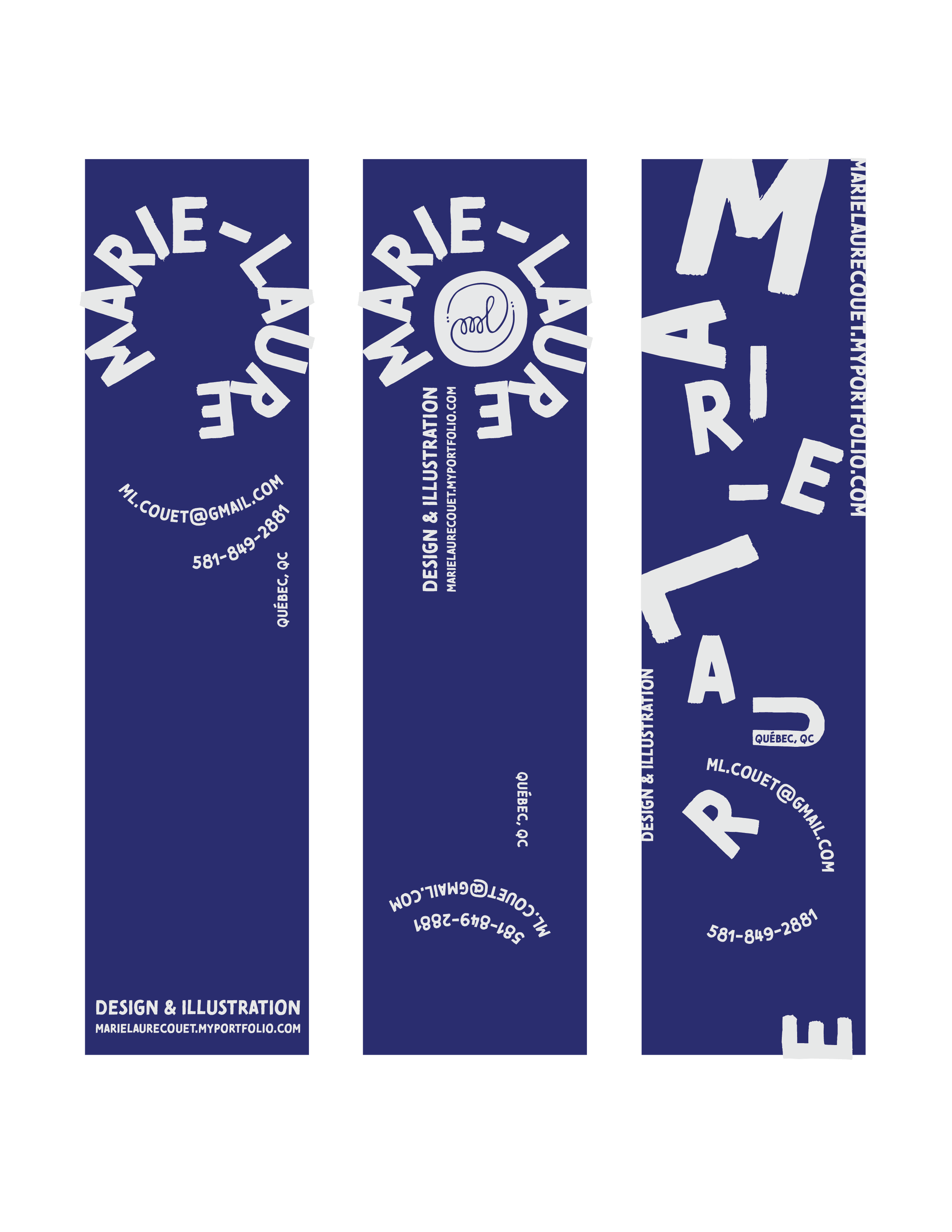
I let go of rigidity to flow like water and seek opportunity. Remaining flexible - to appreciate this moment - I see the silliness of this life. Visually, I have arranged the glyphs and designed the layouts with a playfulness that exudes childlike wonder.
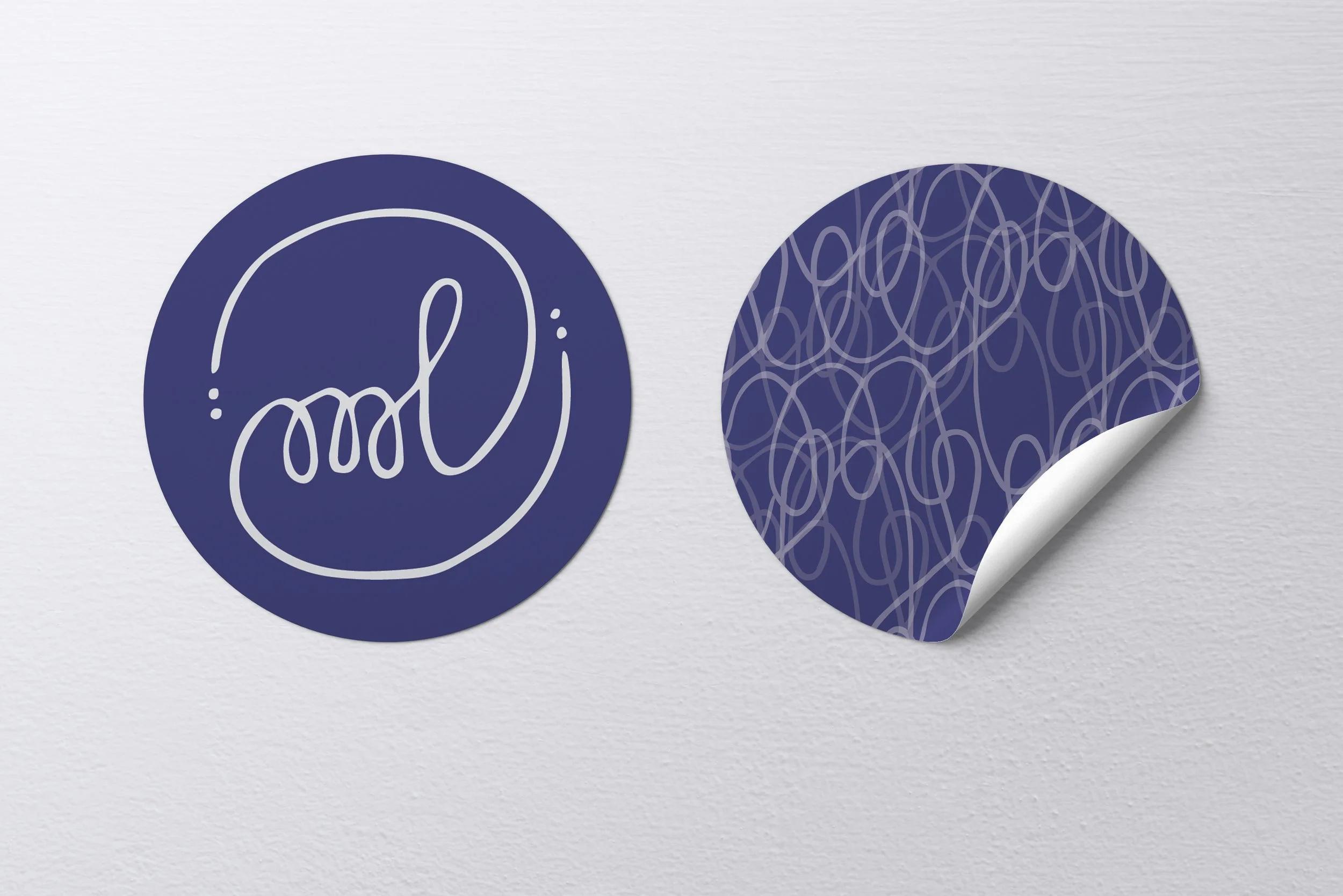
I have always needed to spell out and re-pronounce and insist on being called my full, hyphenated name. The type-as-symbol/dynamic wordmark in bold sans-serif caps makes me feel seen and empowered to display my name with pride.
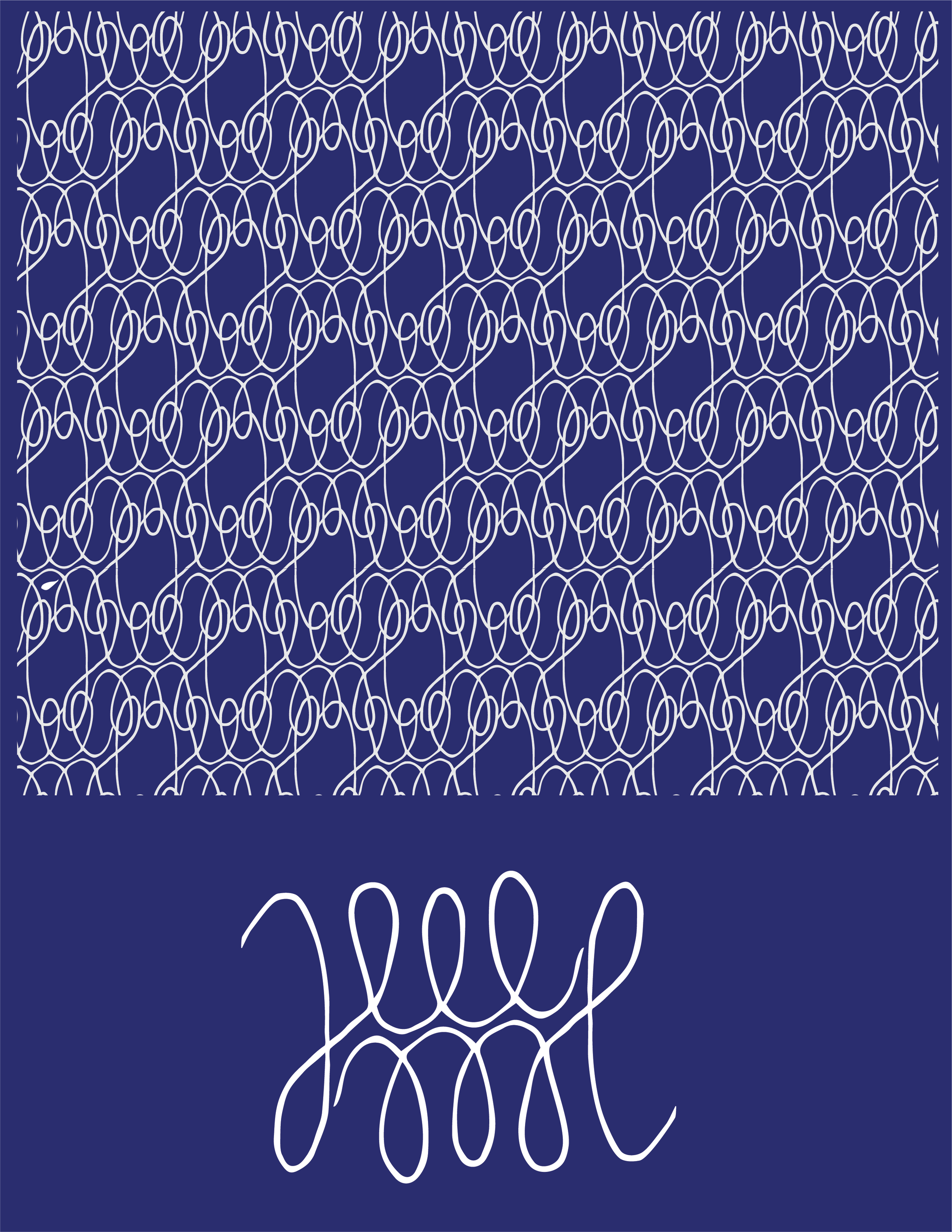
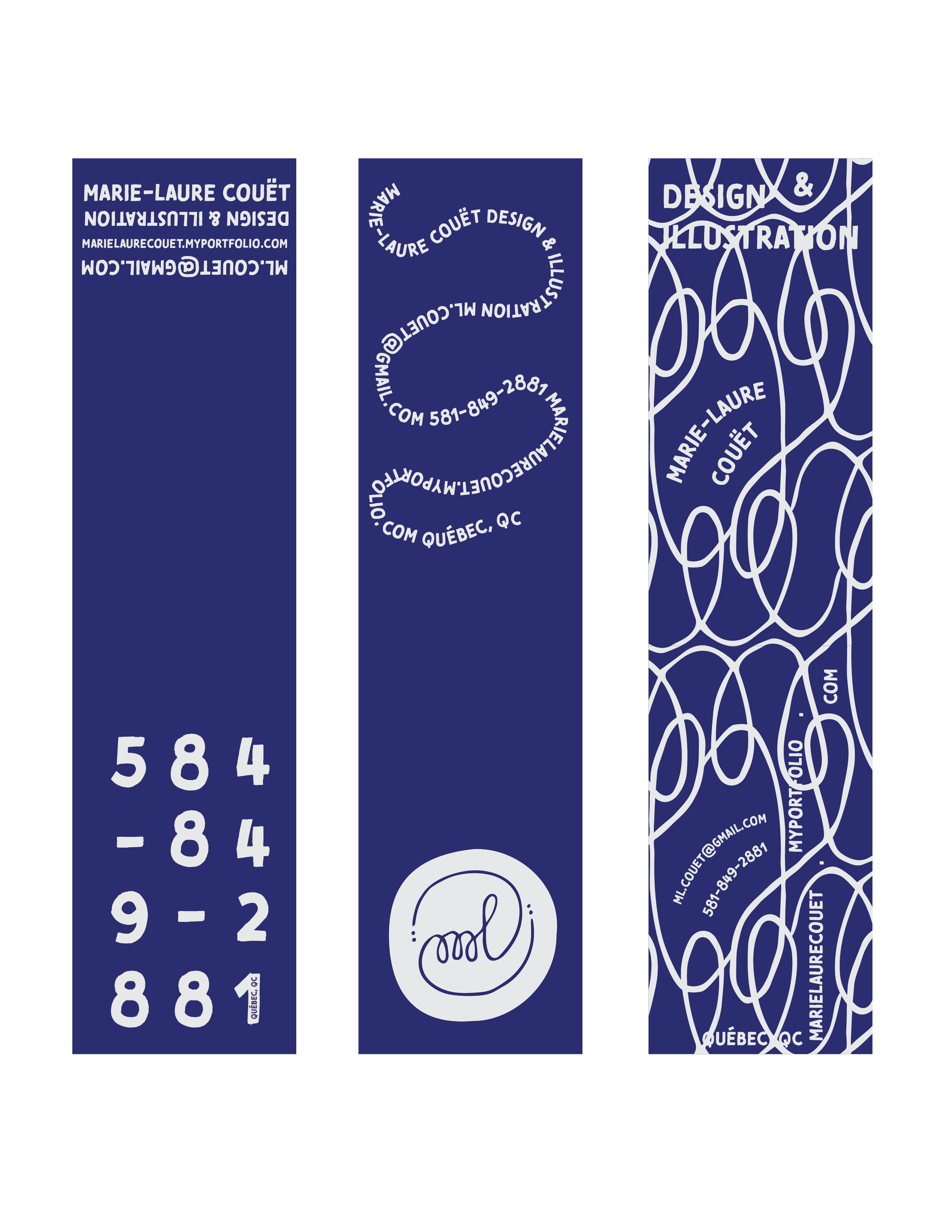
The final design is an evolving type-based identity making use of Marie-Laure’s first name as well as her design philosophy. The palette is indigo paired with warm grey. Both colors feature frequently in her wardrobe and both represent mar - the ocean - which is her name.




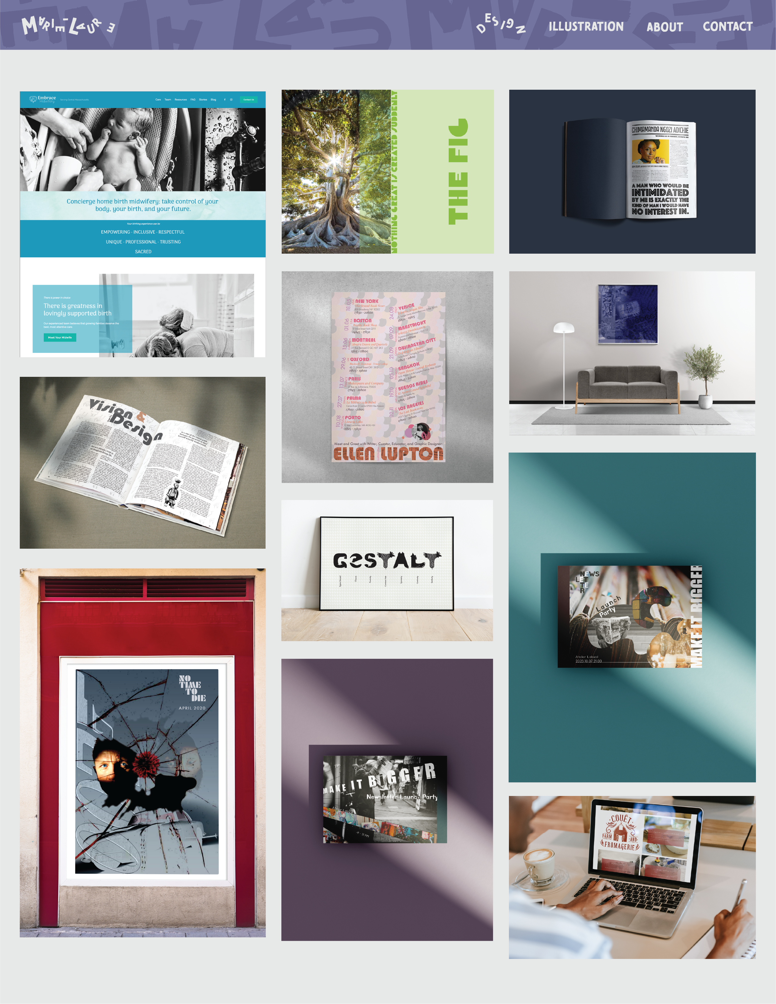

As with all of our projects, before reaching the final version of Marie-Laure’s professional identity, we went through hundreds of iterations.
