SCBWI Canada East Branding
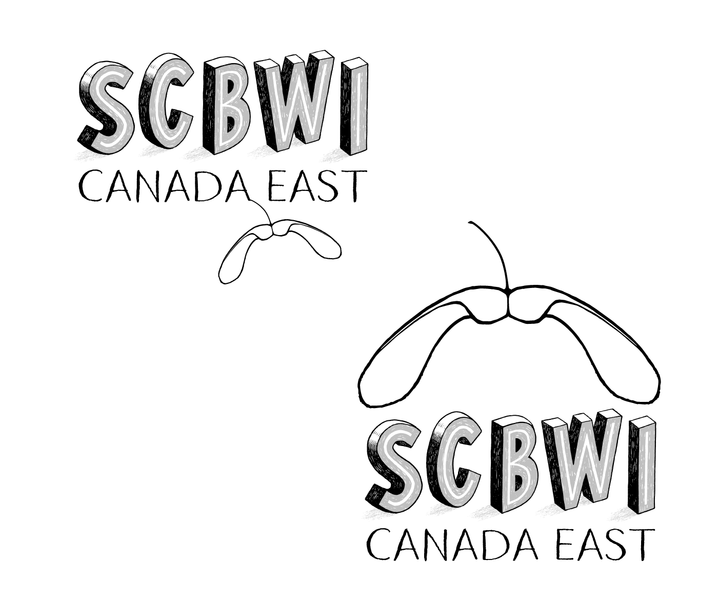
The Society of Children’s Book Writers and Illustrators is an international organization with chapters in regions around the world. In January 2025, SCBWI headquarters revealed their rebrand of the global organization. They worked with award-winning illustrator, John Hendrix, to create the original SCBWI block letters in their signature palette. The Canada East chapter then initiated its regional branding based on the HQ guidelines. Atelier Lalozol worked directly with Canada East and within the established HQ parameters to create a unique chapter identity.
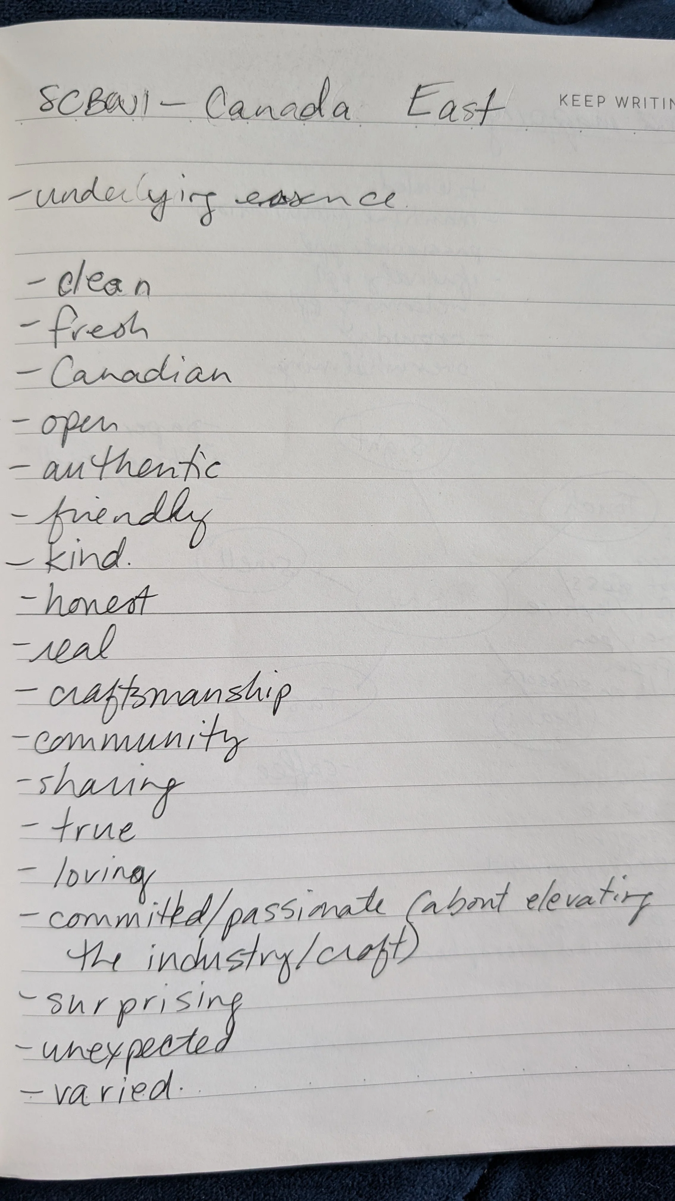
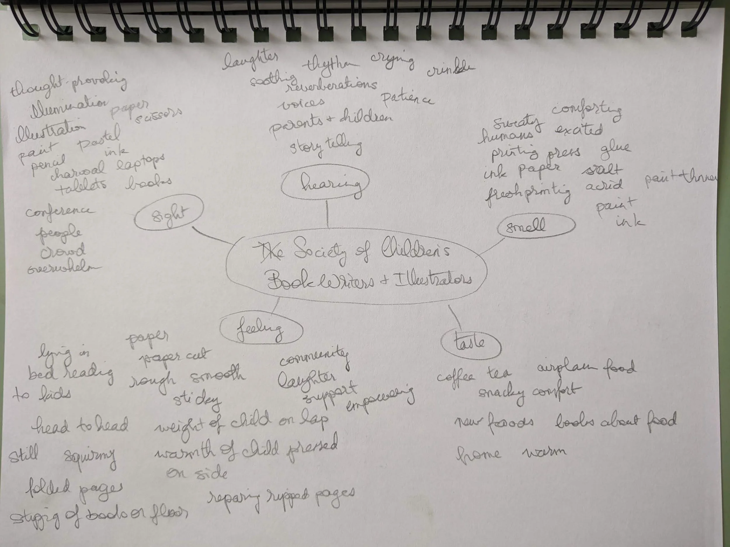
Through workshop and regional team discussions, the guiding concept for this brand design became:
“SCBWI Canada East is a diverse, inclusive, and supportive community uniting writers, illustrators, translators in the eastern provinces of Canada who are dedicated to the creation of children’s literature, often flavoured with a touch of maple.”
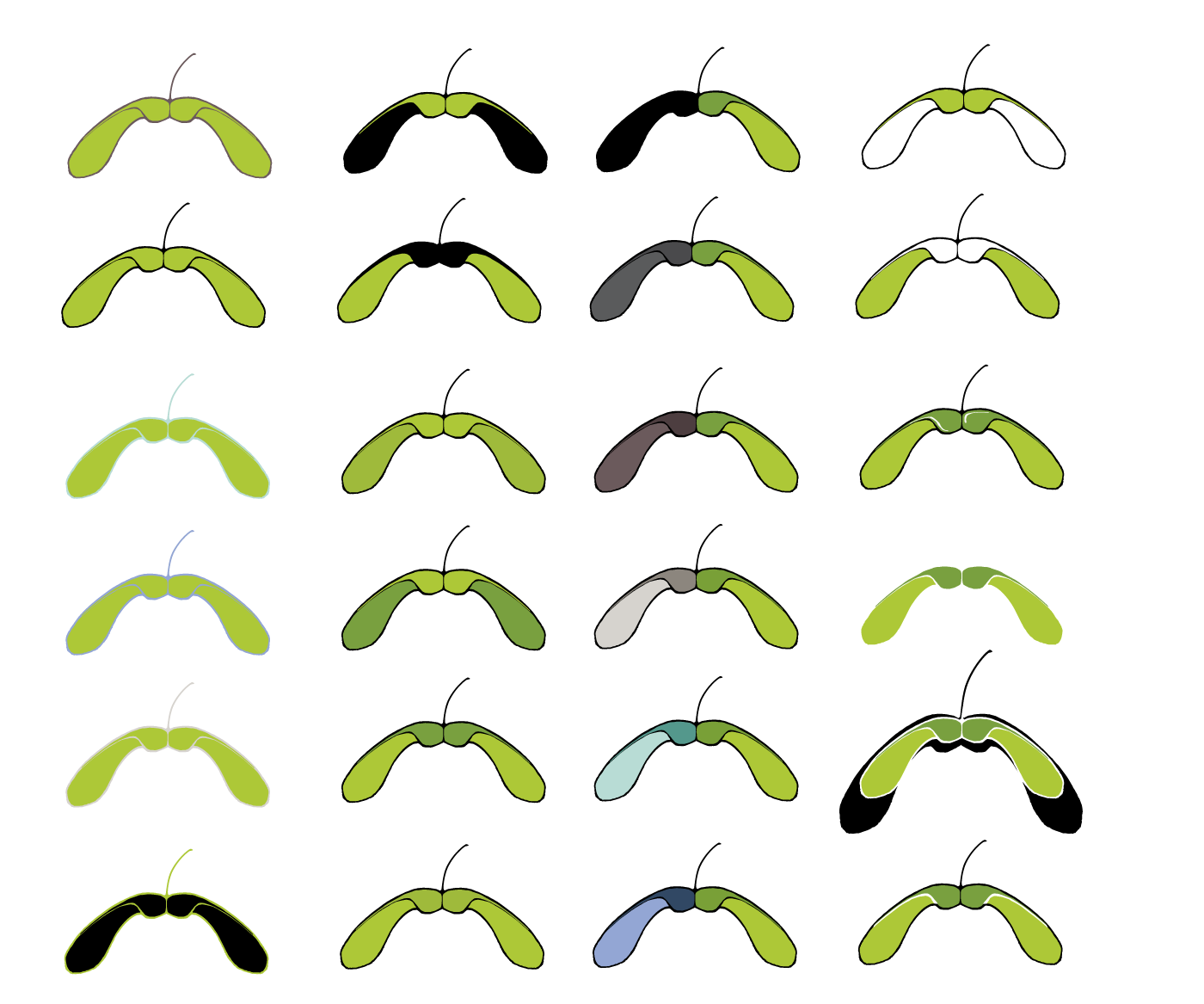
Rather that work within the cliché of the Canadian maple leaf, we decided to explore a deeper narrative of the maple seed that is nourished directly by Canada East.
Canada East is the nurturing soil, the tree, that supports the development and growth of seeds of creativity. The line work for both the wordmark (“Canada East”) and the symbol (the maple seed) resembles the hand-drawn efforts of writers, illustrators, and translators across our community. The literal representation of a maple seed, its volume, and its black outline echoes the SCBWI HQ logo to create a unified look that represents Canada East, specifically.




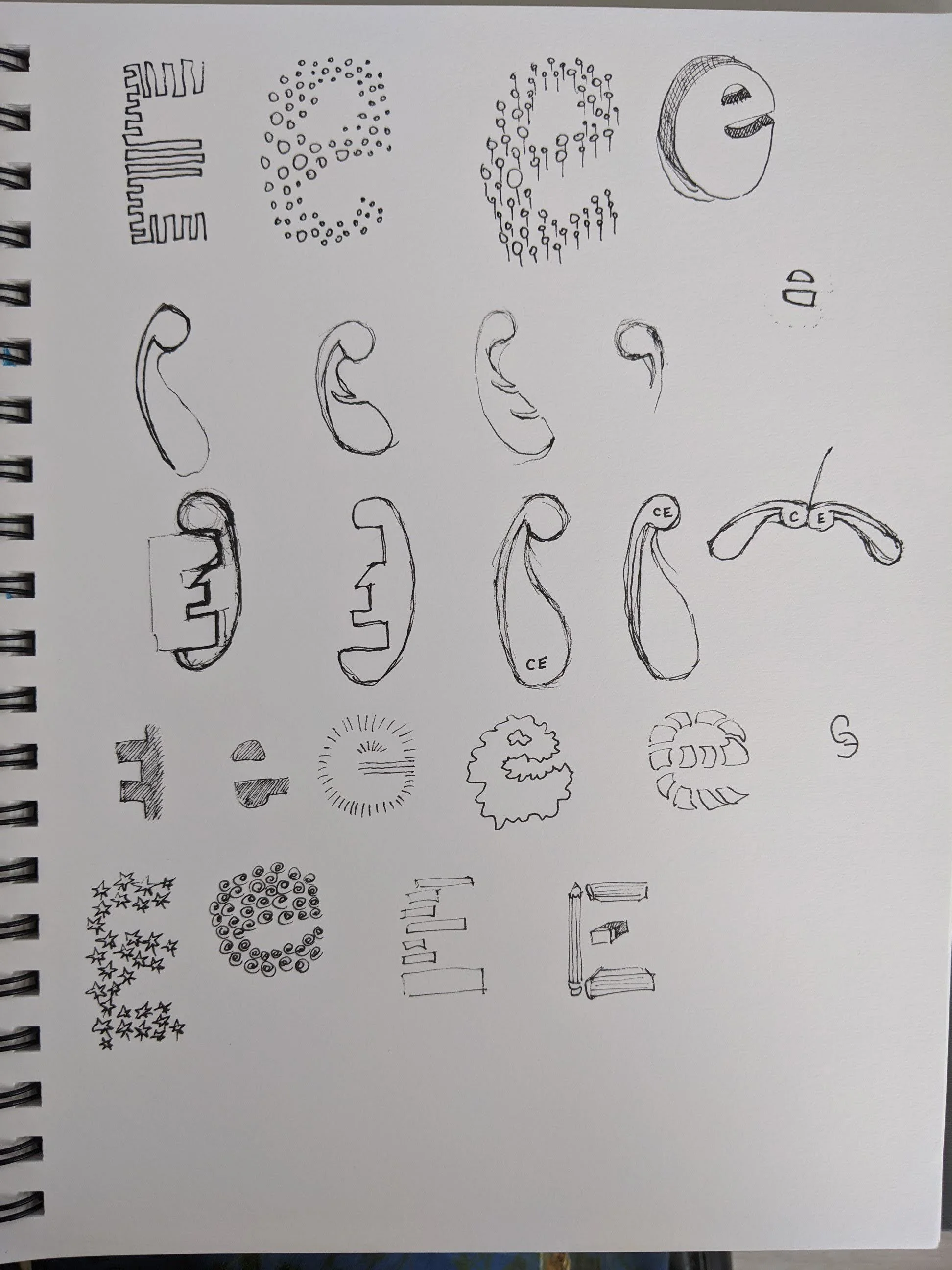
As with all of our projects, before deciding on the final SCBWI Canada East brand identity, we worked through extensive iteration, Variation, and research.


